Combining Pandas and Plotly for Data Visualization
Posted: Fri May 04, 2018 7:02 pm
We will work you through an example of how to use Pandas and Plotly to visualize data. The aim of visualization is not numbers, but to get an insight and a feeling about the data. Pandas is a Python library that makes it easier to work with data - it offers functionalities that make data presentation, visualization and analysis pretty simple task. In this brief tutorial, we will use Plotly offline.
In our tutorial, we will work with the famous "Iris" dataset that is stored on the UCI machine learning repository.
The Iris dataset contains measurements for 150 Iris flowers from three different species.
The three classes, each with 50 measurements, in the Iris dataset are:
We can download the Iris dataset from UCI repository and put it, say on the Desktop, then input the path to load it, but here we will use the pandas library and load the dataset directly from the UCI repository:
We can respectively, print the first/last few rows of the dataset we loaded as follows:
Let's split the data table into data values X and class/species labels Y:
The Iris dataset is now formated in form of a matrix where the columns are the different features, and every row represents a separate flower sample. Each sample row
  can be viewed as a 4-dimensional vector:

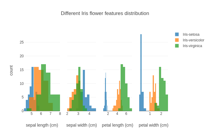
Finally, let's visualize our dataset using histograms:
The output is:
In our tutorial, we will work with the famous "Iris" dataset that is stored on the UCI machine learning repository.
The Iris dataset contains measurements for 150 Iris flowers from three different species.
The three classes, each with 50 measurements, in the Iris dataset are:
- Iris-setosa
- Iris-versicolor
- Iris-virginica
- sepal length in cm
- sepal width in cm
- petal length in cm
- petal width in cm
We can download the Iris dataset from UCI repository and put it, say on the Desktop, then input the path to load it, but here we will use the pandas library and load the dataset directly from the UCI repository:
- import pandas as pds
- df = pds.read_csv(
- filepath_or_buffer='https://archive.ics.uci.edu/ml/machine-learning-databases/iris/iris.data',
- header=None,
- sep=',')
- df.columns=['sepal_length', 'sepal_width', 'petal_length', 'petal_width', 'class']
- df.dropna(how="all", inplace=True) # This drops the empty line at the file-end
We can respectively, print the first/last few rows of the dataset we loaded as follows:
- print(df.head())
- sepal_length sepal_width petal_length petal_width class
- 0 5.1 3.5 1.4 0.2 Iris-setosa
- 1 4.9 3.0 1.4 0.2 Iris-setosa
- 2 4.7 3.2 1.3 0.2 Iris-setosa
- 3 4.6 3.1 1.5 0.2 Iris-setosa
- 4 5.0 3.6 1.4 0.2 Iris-setosa
- print(df.tail())
- sepal_length sepal_width petal_length petal_width class
- 145 6.7 3.0 5.2 2.3 Iris-virginica
- 146 6.3 2.5 5.0 1.9 Iris-virginica
- 147 6.5 3.0 5.2 2.0 Iris-virginica
- 148 6.2 3.4 5.4 2.3 Iris-virginica
- 149 5.9 3.0 5.1 1.8 Iris-virginica
Let's split the data table into data values X and class/species labels Y:
- X = df.ix[:,0:4].values
- Y = df.ix[:,4].values
The Iris dataset is now formated in form of a
Finally, let's visualize our dataset using histograms:
- from plotly.graph_objs import *
- traces = []
- legend = {0:False, 1:False, 2:False, 3:True}
- #You can choose other colors
- colors = {'Iris-setosa': 'rgb(31, 119, 180)',
- 'Iris-versicolor': 'rgb(255, 127, 14)',
- 'Iris-virginica': 'rgb(44, 160, 44)'}
- for col in range(4):
- for key in colors:
- traces.append(Histogram(x=X[y==key, col],
- opacity=0.75,
- xaxis='x%s' %(col+1),
- marker=Marker(color=colors[key]),
- name=key,
- showlegend=legend[col]))
- data = Data(traces)
- layout = Layout(barmode='overlay',
- xaxis=XAxis(domain=[0, 0.25], title='sepal length (cm)'),
- xaxis2=XAxis(domain=[0.3, 0.5], title='sepal width (cm)'),
- xaxis3=XAxis(domain=[0.55, 0.75], title='petal length (cm)'),
- xaxis4=XAxis(domain=[0.8, 1], title='petal width (cm)'),
- yaxis=YAxis(title='count'),
- title='Different Iris flower features distribution')
- #Use Plotly offline
- from plotly.offline import plot
- fig = Figure(data=data, layout=layout)
- plot(fig)
The output is: