Visualizing random samples from a normal (Gaussian) distribution
Posted: Wed Sep 28, 2016 1:45 pm
The normal (Gaussian) distribution occurs often in nature, especially as the sample becomes large.
The probability density for the Gaussian distribution is
$$f(x, |\mu, \sigma^{2}) = \left(\sqrt{2\pi \sigma^{2}}\right)^{-1}e^{-\dfrac{(x-\mu)^{2}}{2\sigma^{2}}}$$
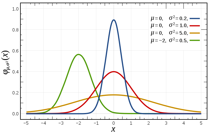
where \(\mu\) is the mean and \(\sigma\) the standard deviation. The square of the standard deviation, \(\sigma^2\), is called the variance (see variance).
The probability density function of the normal distribution, is often called the bell curve because of its characteristic shape:

The function has its peak at the mean, and its "spread" increases with the standard deviation.
Below is the Python program that visualizes the normal distribution from 1200 random samples, with \(\mu = 0, \ \sigma = 0.1\) and outputs the normal distribution curve including a histogram (see diagram below):

The probability density for the Gaussian distribution is
$$f(x, |\mu, \sigma^{2}) = \left(\sqrt{2\pi \sigma^{2}}\right)^{-1}e^{-\dfrac{(x-\mu)^{2}}{2\sigma^{2}}}$$
where \(\mu\) is the mean and \(\sigma\) the standard deviation. The square of the standard deviation, \(\sigma^2\), is called the variance (see variance).
The probability density function of the normal distribution, is often called the bell curve because of its characteristic shape:
The function has its peak at the mean, and its "spread" increases with the standard deviation.
Below is the Python program that visualizes the normal distribution from 1200 random samples, with \(\mu = 0, \ \sigma = 0.1\) and outputs the normal distribution curve including a histogram (see diagram below):
- """Visualize normal distribution curve, including histogram"""
- import numpy as np
- import matplotlib.pyplot as plt
- import pylab
- mu, sigma = 0, 0.1 # mean and standard deviation
- gauss = np.random.normal(mu, sigma, 1200) #Generate 1200 random samples
- count, x, ignored = plt.hist(gauss, 60, normed=True) # x is the number of bins
- plt.plot(x, 1/(sigma * np.sqrt(2 * np.pi)) * np.exp( - (x - mu)**2 / (2 * sigma**2) ), linewidth=2, color='magenta', label = "mu = 0.0, sigma = 0.1")
- plt.legend(loc = 1 )
- plt.title("Normal Distribution")
- pylab.savefig('Norm_Distr', bbox_inches='tight') #Save the plot
- plt.show()