The basis of linear regression analysis is to find a straight line (linear equation) that fits or forecasts a set of observations/unobserved values in two dimensions such as all points in a scatter plot which follow or are expected to follow some pattern (usually linear).
Suppose we want to find the relationship between student grades
where
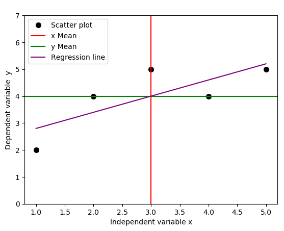
We use a simple Python code below to plot the regression line, together with the lines that indicate the means of independent and dependent variables.
- #Import required libraries
- import numpy as np
- import matplotlib.pyplot as plt
- #Create data points
- x = np.array([1,2,3,4,5])
- y = np.array([2,4,5,4,5])
- fig = plt.subplot(111, aspect='auto')
- plt.xlabel("Independent variable x")
- plt.ylabel("Dependent variable y")
- plt.ylim(top=7)
- fig.plot(x, y, 'o', markersize=7, color='black', alpha=1.0, label="Scatter plot")
- plt.axvline(x=np.mean(x), color='red', linestyle='-', alpha=1.0, label="x Mean")
- plt.axhline(y=np.mean(y), color='green', linestyle='-', alpha=1.0, label="y Mean")
- #Fit function
- b1, b0 = np.polyfit(x, y, deg=1)
- f = lambda x: b1*x + b0
- plt.plot(x,f(x), c="purple", linestyle = "-", label="Regression line")
- #Legend, save
- plt.legend(loc=2)
- plt.savefig('regression_line.png', format="png", bbox_inches='tight')
It turns out that the regression line passes through the point where the lines for the means of independent variable
The real world observational data do not always behave linearly. In general, the data will be a series of
Errors and Error bars
We introduce these errors (or unobserved deviations from the regression line), and denote them as
- #Import required libraries
- import numpy as np
- import matplotlib.pyplot as plt
- #Create data points
- x = np.array([1,2,3,4,5])
- y = np.array([2,4,5,4,5])
- fig = plt.subplot(111, aspect='auto')
- plt.title(" ")
- plt.xlabel("Independent variable x")
- plt.ylabel("Dependent variable y")
- plt.ylim(top=7)
- fig.plot(x, y, 'o', markersize=7, color='black', alpha=1.0, label="Scatter plot")
- plt.axvline(x=np.mean(x), color='red', linestyle='--', alpha=1.0, label="x Mean")
- plt.axhline(y=np.mean(y), color='green', linestyle='--', alpha=1.0, label="y Mean")
- #Get intercept and the slope of the fit function
- b1, b0 = np.polyfit(x, y, deg=1)#Fit as first degree polynomial
- f = lambda x: b1*x + b0
- plt.plot(x,f(x), c="purple", linestyle = "-", label="Regression line")
- #Plot half errorbars
- plt.errorbar(x,f(x),xerr=0, yerr=[np.zeros(5), y-f(x)], fmt="o", c="blue", label=r"${\rm Error,} \ \epsilon$")
- plt.legend(loc=2)
- plt.savefig('regression_line_errors.png', format="png", bbox_inches='tight')
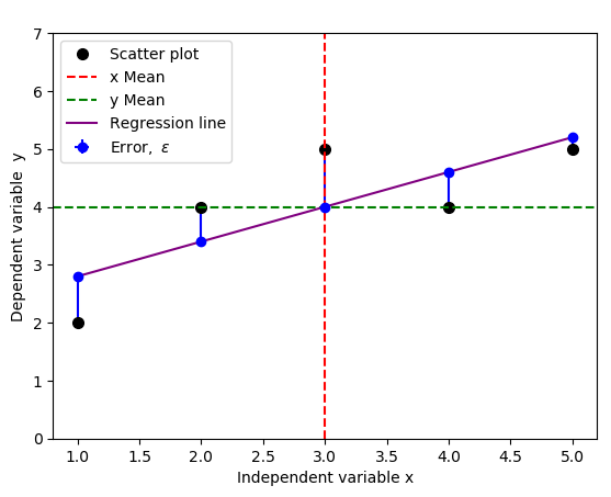
The result is the figure below that include the errors, indicated by vertical blue lines:
You could change yerr=[np.zeros(5), y-f(x)] to yerr=[y-f(x), np.zeros(5)] to indicate the opposite errors if needed,
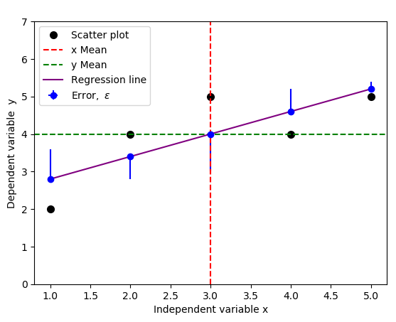
but a standard practice usually includes both negative and positive errors, because we only care about the magnitude of the errors, not direction. You can achieve this by replacing yerr=[np.zeros(5), y-f(x)] with yerr=y-f(x) in the code above:
Depending on your data type and the errors you're interested in, below are few illustrations of typical error bars.
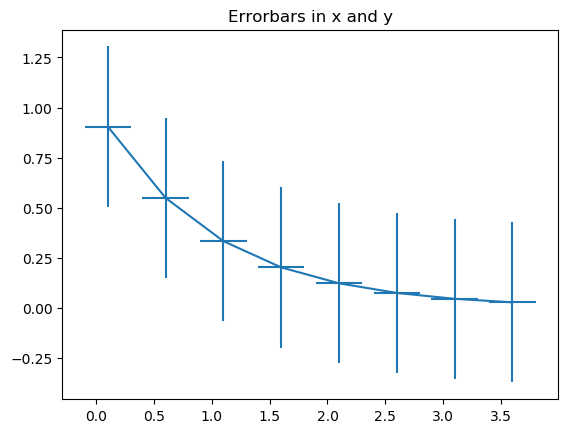
Example 1: error bars in x and y
- import numpy as np
- import matplotlib.pyplot as plt
- #Generate xy data
- x = np.arange(0.1, 4, 0.5)
- y = np.exp(-x)
- #Variable error bar values
- yerr = 0.1 + 0.2*np.sqrt(x)
- xerr = 0.1 + yerr
- #Illustrate basic Matplotlib (can use Pylab) ploting interface
- plt.figure()
- plt.errorbar(x, y, xerr=0.2, yerr=0.4)
- plt.title("Errorbars in x and y")
- plt.savefig('xy_Errobars.png', format="png", bbox_inches='tight')
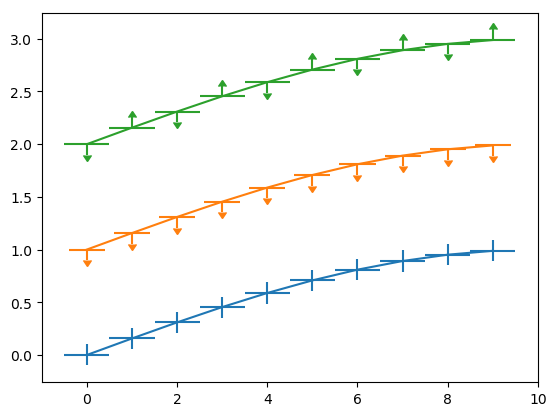
- import numpy as np
- import matplotlib.pyplot as plt
- fig = plt.figure(0)
- x = np.arange(10.0)
- y = np.sin(np.arange(10.0) / 20.0 * np.pi)
- plt.errorbar(x, y,xerr=0.5, yerr=0.1)
- y = np.sin(np.arange(10.0) / 20.0 * np.pi) + 1
- plt.errorbar(x, y,xerr=0.4, yerr=0.1, uplims=True)
- y = np.sin(np.arange(10.0) / 20.0 * np.pi) + 2
- upperlimits = np.array([1, 0] * 5)
- lowerlimits = np.array([0, 1] * 5)
- plt.errorbar(x, y, xerr=0.5, yerr=0.1, uplims=upperlimits, lolims=lowerlimits)
- plt.savefig('Errobars_xy.png', format="png", bbox_inches='tight')
- plt.xlim(-1, 10)
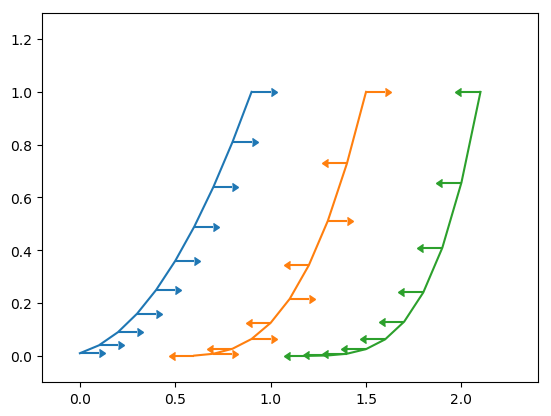
Example 2 : x error bars only
- import numpy as np
- import matplotlib.pyplot as plt
- fig = plt.figure(1)
- x = np.arange(10.0) / 10.0
- y = (x + 0.1)**2
- plt.errorbar(x, y, xerr=0.1, xlolims=True)
- y = (x + 0.1)**3
- plt.errorbar(x + 0.6, y, xerr=0.1, xuplims=upperlimits, xlolims=lowerlimits)
- y = (x + 0.1)**4
- plt.errorbar(x + 1.2, y, xerr=0.1, xuplims=True)
- plt.xlim(-0.2, 2.4)
- plt.ylim(-0.1, 1.3)
- plt.savefig('Errobars_xonly.png', format="png", bbox_inches='tight')
- plt.show()
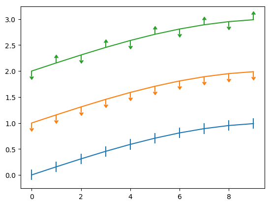
Example 3: y errobars only
- fig = plt.figure(0)
- x = np.arange(10.0)
- y = np.sin(np.arange(10.0) / 20.0 * np.pi)
- plt.errorbar(x, y, yerr=0.1)
- y = np.sin(np.arange(10.0) / 20.0 * np.pi) + 1
- plt.errorbar(x, y, yerr=0.1, uplims=True)
- y = np.sin(np.arange(10.0) / 20.0 * np.pi) + 2
- upperlimits = np.array([1, 0] * 5)
- lowerlimits = np.array([0, 1] * 5)
- plt.errorbar(x, y, yerr=0.1, uplims=upperlimits, lolims=lowerlimits)
- plt.savefig('Errobars_yonly.png', format="png", bbox_inches='tight')
- plt.xlim(-1, 10)
See refs [1], [2].
Thus, a linear regression model must now include this error
This redefined linear regression model can then be used to derive an equation of a line that minimizes these errors. The approach is based on the Least Square Method. The least square method aims to minimize the errors, which are the differences between the actual values (scatter plot points) and estimated values (points along the regression line) and make them small as possible. We show how to use the ordinary least squares (OLS) method below to analytically solve for the slope and intercept estimates and use them to fit a new regression line.
Simple Linear Regression Model - Ordinary Least Squares (OLS): Closed Form Solution
There are inbuilt functions in most of the programming languages such as Python, R, MATLAB and Octave for computing the slope and the
we need to find
where
We expand the cost functional
and then minimize it by taking the partial derivatives of the cost functional
Therefore,
Similarly,
which implies
Now, we have the
and the gradient estimate,
Here,
-
is the dot product of the two vectors
Now, we're about to introduce the notion of covariance. We can view covariance as the average of the products of the mean deviations
Covariance of two variables,
where
In general, covariance centers the data to the mean, and the division by
We can then use the Python code below to calculate the
- def simple_linear_regression(x, y):
- """Returns y-intercept and gradient of a simple linear regression line"""
- #Initial sums
- n = float(len(x)) #We can use x.sum()
- sum_x = np.sum(x)
- sum_y = np.sum(y)
- sum_xy = np.sum(x*y)
- sum_xx = np.sum(x**2)
- #Formula for gradient/slope, b1
- gradient = (sum_xy - (sum_x*sum_y)/n)/(sum_xx - (sum_x*sum_x)/n)
- #Formula for y-intercept, b0
- intercept = sum_y/n - gradient*(sum_x/n)
- return (intercept, gradient)
- x = np.array([1,2,3,4,5])
- y = np.array([2,4,5,4,5])
- print("The y-intercept and gradient are:", simple_linear_regression(x, y))
- The y-intercept and gradient are: (2.2, 0.6)
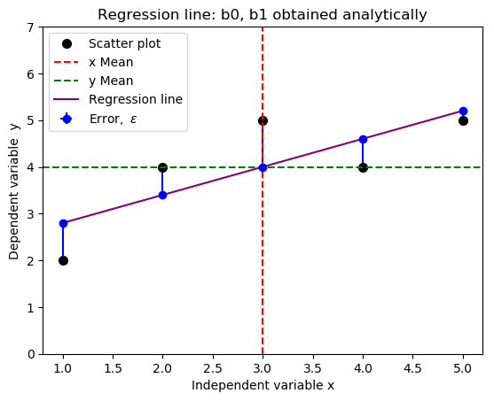
- #Import required libraries
- import numpy as np
- import matplotlib.pyplot as plt
- #Create data points
- x = np.array([1,2,3,4,5])
- y = np.array([2,4,5,4,5])
- fig = plt.subplot(111, aspect='auto')
- plt.title("Regression line: b0 and b1 obtained analytically")
- plt.xlabel("Independent variable x")
- plt.ylabel("Dependent variable y")
- plt.ylim(top=7)
- fig.plot(x, y, 'o', markersize=7, color='black', alpha=1.0, label="Scatter plot")
- plt.axvline(x=np.mean(x), color='red', linestyle='--', alpha=1.0, label="x Mean")
- plt.axhline(y=np.mean(y), color='green', linestyle='--', alpha=1.0, label="y Mean")
- #Define the slope and intercept of the fit function
- b1, b0 = 0.6, 2.2
- f = lambda x: b1*x + b0
- plt.plot(x,f(x), c="purple", linestyle = "-", label="Regression line")
- #Plot half errorbars
- plt.errorbar(x,f(x),xerr=0, yerr=[np.zeros(5), y-f(x)], fmt="o", c="blue", label=r"${\rm Error,} \ \epsilon$")
- plt.legend(loc=2)
- plt.savefig('new_fit_regression_line.png', format="png", bbox_inches='tight')
Relationship Between Covariance and Correlation
From the gradient estimate we obtained above,
We know that
We have introduced new parameters as follows:
-
-
-
- The variance is a covariance of a variable, say
- The square root of variance is called standard deviation.
The solution to these challenges is to normalize the covariance, that's dividing the covariance,
We have seen that covariance simply centers the data. Correlation (dimensionless), however, not only centers the data but also normalizes the data using the standard deviations of the respective variables. Here are few remarks we can make in regard to correlation:
- Positive correlation/relationship means the value of dependent variable increases/decreases as the value of independent variable increases/decreases (
- Negative correlation/relationship means the value of dependent variable decreases/increases as the value of independent variable increases/decreases (
- If we get the value of correlation close to zero, it means that the two variables are uncorrelated (zero means perfectly uncorrelated).
The relationship between the Correlation Coefficient,
From
Let's substitute the expressions we obtained for the estimates of
This last equation is in the form
We can now generalize the notion,
This notion allows us to construct a formula for
Therefore, we can deduce that, the coefficient of determination,
From
Introducing indices and summation for
This analysis can be extended to higher dimensions than 2.
Computing
In regression analysis,
- the mean of actual values of the dependent variable; in this case, we will use values for the variable
- distances of actual values for the depependent variable,
- distances of estimated values (regression line) to the mean,
We summarize this process using the table below.
Note that, the estimated values,
We can therefore compute R-squared as follows:
In most cases, the formula for R-squared is commonly acronymised as
where,
- ESS/SSR means ESS or SSR, similarly, TSS/SST means TSS or SST.
- ESS is the explained sum of squares, also known as the model sum of squares or sum of squares due to regression ("SSR" – not to be confused with the sum of squared residuals (SSR) that we will explain below).
- The residual sum of squares (RSS),
also known as the sum of squared residuals (SSR) ( not to be confused with the sum of squares due to regression "SSR" above) or the sum of squared errors of prediction (SSE). This is the sum of the squares of residuals (sum of deviations of predicted values/estimates from actual empirical/observational data). - TSS is the total sum of squares, alternatively known as sum of the squares (SST), defined as the sum, over all observations, of the squared differences of each observation from the overall mean.
- Generally (see here), the total sum of squares (TSS) = explained sum of squares (ESS) + residual sum of squares (RSS).
Most importantly, don't care much about these terms and their abbreviations, focus on mathematics and how we arrived to
Enjoy maths
Welcome for suggestions and improvements: @Simulink @cache @jiwe @FantasmaDiamato @kipanga @RealityKing @Forbidden_Technology