In this post, we present various multivariate data visualization techniques using Python programming language and show how different choices of data visualization can progressively improve its representation and interpretation.
It is important to acquaint yourself with multinormal or multivariate Gaussian distribution if you haven't done so.
The general approach to generate/draw random samples from a multivariate normal distribution in Python is by using multivariate_normal function,
sample = multivariate_normal(mean, covariance, options), see random sampling at Scipy.org.
1. Scatter Plot
A scatter plot traditionally displays the value of 2 sets of data on 2 dimensions - xy plane, where each data point represents an observation. Scatter plot is useful to study the relationship between variables. We can use different colors or/and shapes for data points (dots) illustration. 2-dimensional scatter point can be extended to 3-dimensional scatter plot by adding one more dimension or plot what is called bubble plot, where the third dimension or the values of an additional variable are represented by the size of the dots. It is obvious that too many bubbles make the chart hard to read, so bubble plotting is usually not recommended for big amount of data.
Below is a piece of code to produce a scatter plot from 200 multivariate normal distribution randomly generated data points.
- # Import required libraries
- import numpy as np
- import matplotlib.pyplot as plt
- from scipy.stats import kde
- #Create 200 data points
- data = np.random.multivariate_normal([0, 0], [[1, 0.5], [0.5, 3]], (200,))
- x, y = data.T #Shape = (200, 200)
- fig = plt.subplot(111, aspect='auto') #choose 'equal' if you want
- plt.title("Scatter Plot")
- fig.plot(x, y, 'o', markersize=7, color='black', alpha=1.0, label="Scatter")
- plt.legend(loc=1)
- plt.savefig('scatter_plot.png', bbox_inches='tight') #Save the plot
- plt.show()
The scatter plot output is
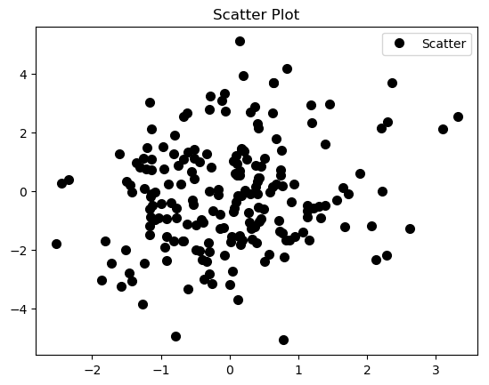
As suggested before, there is a lot of over plotting in the scatter plot that makes it hard to read, even worse if we are dealing with larger random samples.
2. Histogram
An histogram is a graphical representation of the distribution of numerical data, where the input is one numerical variable only. The variable is split into several bins, and the number of observations in each bin is represented by the height of the bar. Be aware that the shape of the histogram is greatly determined by the number of bins you set.
You can decide to represent your data by using a simple histogram that is produced by just the few lines of code below (see a method that gives you more control in creating histograms for multiple datasets and compare their distributions on the same axes, in our case, the datasets represented by variables x and y above, ):
- data = np.random.multivariate_normal([0, 0], [[1, 0.5], [0.5, 3]], (200,))
- plt.title("Histogram")
- plt.hist(data, bins = 5, facecolor = 'lightblue', alpha = 1.0) #Here the number of bins = 5
- plt.savefig('https://github.com/TSSFL/figures/blob/master/histogram.png', bbox_inches='tight')
which will result to
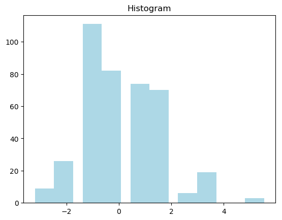
Histogram may however be not a good choice in most cases.
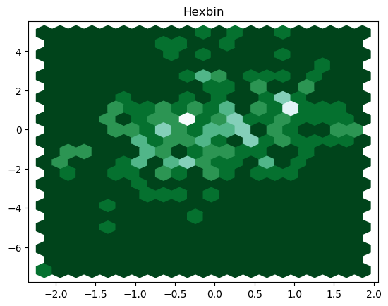
3. Hexbin or 2-D Histogram
We can improve our solution by cutting the plotting window into several bins, and represent the number of data points in each bin by a color.
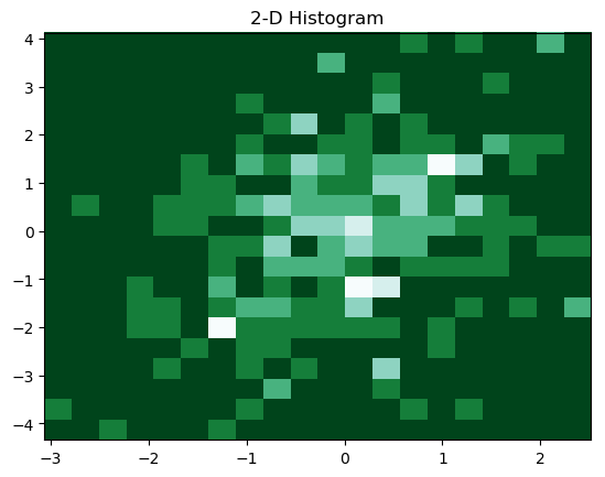
A 2-D histogram or a 2-D density is an extension of the well known histogram. It shows the distribution of values in a data set across the range of two quantitative variables. For too many data points, the 2-D density plot counts the number of observations within a particular area of the 2-D space. Depending on the shape of the bin, this specific area can be a square or a hexagon (hexbin), hence, resulting in Hexbin plot or 2-D histogram.
A 2-D histogram is simple and easy to understand, it fundamentally a blocky plot.
We can achieve a hexbin plot through the following lines of code:
- #Split the plotting window into 20 hexbins
- nbins = 20
- plt.title('Hexbin')
- plt.hexbin(x, y, gridsize=nbins, cmap=plt.cm.BuGn_r)
- plt.savefig('https://github.com/TSSFL/figures/blob/master/hexbins.png', bbox_inches='tight')
- plt.show()
The resulting hexbin is
We can as well plot a 2-D histogram by using the following piece of code:
- plt.title('2-D Histogram')
- plt.hist2d(x, y, bins=nbins, cmap=plt.cm.BuGn_r)
- plt.savefig('https://github.com/TSSFL/figures/blob/master/two_D_histogram.png', bbox_inches='tight')
Resulting 2-D histogram is
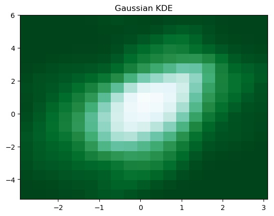
5. Gaussian Kernel-Density Estimate (KDE)
We can smooth a 2-D histogram (2-D density plot) to make a kernel-density estimate (KDE). Instead of a point falling into a particular bin, it adds a weight to surrounding bins, usually in a bell-shaped curve "Gaussian distribution". There is no one correct way of plotting Gaussian KDE, you need to be more careful to get the correctly statistically interpretable Gaussian KDE plot. Gaussian KDE is basically a 2-D density plot.
This piece of code
- #Evaluate a Gaussian KDE on a regular grid of nbins x nbins over data extents
- k = kde.gaussian_kde(data.T)
- xi, yi = np.mgrid[x.min():x.max():nbins*1j, y.min():y.max():nbins*1j]
- zi = k(np.vstack([xi.flatten(), yi.flatten()]))
- #Plot a density-estimate
- plt.title('Gaussian KDE')
- plt.pcolormesh(xi, yi, zi.reshape(xi.shape), cmap=plt.cm.BuGn_r)
- plt.savefig('https://github.com/TSSFL/figures/blob/master/Gaussian_KDE.png', bbox_inches='tight')
produces the Gaussian KDE figure below.
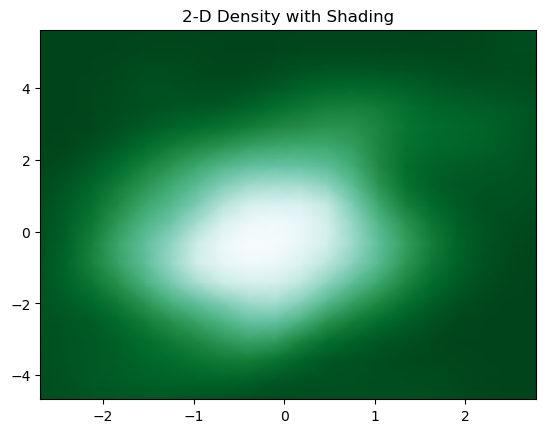
6. 2-D Density with Shading
We can add shading to 2-D density plot using the below piece of code
- plt.title('2-D Density with Shading')
- plt.pcolormesh(xi, yi, zi.reshape(xi.shape), shading='gouraud', cmap=plt.cm.BuGn_r)
- plt.savefig('https://github.com/TSSFL/figures/blob/master/Shaded_2_D_Density.png', bbox_inches='tight')
to have the plot
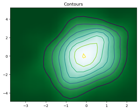
7. Adding Contours
We can finally add contours in a 2-D density to denote each step using the code
- #Add contours
- plt.title('Contour')
- plot.pcolormesh(xi, yi, zi.reshape(xi.shape), shading='gouraud', cmap=plt.cm.BuGn_r)
- plot.contour(xi, yi, zi.reshape(xi.shape) )
- plt.savefig('https://github.com/TSSFL/figures/blob/master/Contours.png', bbox_inches='tight')
The resulting contour plot is
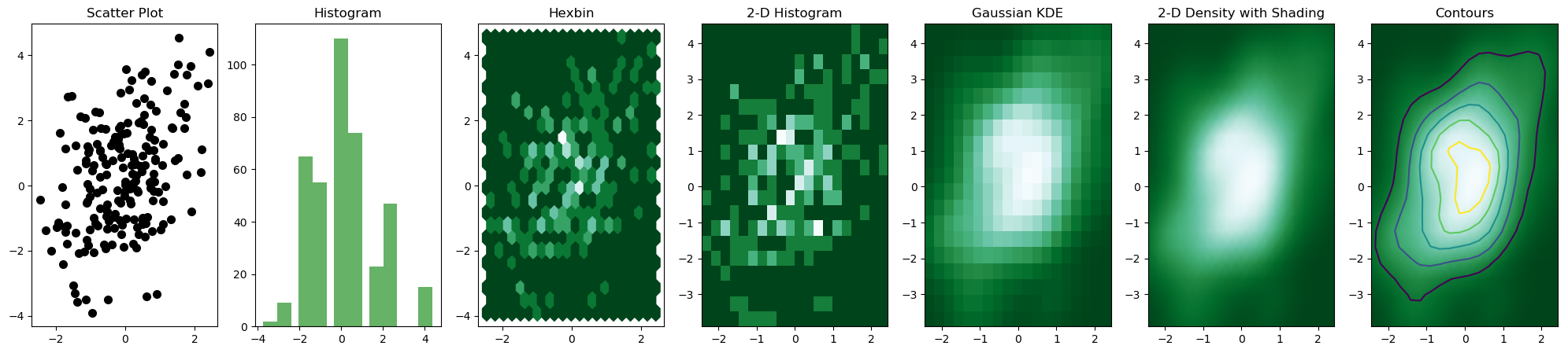
But, the most convenient and efficient way is to plot these figures altogether. We can achieve this by combining all the code snippets and creating a figure with 7 subplots and use axes to plot figures in their respective positions:
fig, axes = plt.subplots(ncols=6, nrows=1, figsize=(25, 6))
The whole code is
- """From scatter to contour plot"""
- #Import required libraries
- import numpy as np
- import matplotlib.pyplot as plt
- from scipy.stats import kde
- #Create 200 data points
- data = np.random.multivariate_normal([0, 0], [[1, 0.5], [0.5, 3]], (200,))
- x, y = data.T
- #Create a figure with 7 plot grids
- fig, axes = plt.subplots(ncols=7, nrows=1, figsize=(25, 5))
- #Scatter plot, see that there is a lot of over plotting here
- axes[0].set_title('Scatter Plot')
- axes[0].plot(x, y, 'o', markersize=7, color='black', alpha=1.0, label="Scatter")
- #Plot Histogram
- axes[1].set_title("Histogram")
- axes[1].hist(data, bins = 5, facecolor = 'green', alpha = 0.6) #Here the number of bins = 5
- #Split the plotting window into several hexbins
- nbins = 20
- axes[2].set_title('Hexbin')
- axes[2].hexbin(x, y, gridsize=nbins, cmap=plt.cm.BuGn_r)
- #Plot 2-D Histogram
- nbins = 20
- axes[3].set_title('2-D Histogram')
- axes[3].hist2d(x, y, bins=nbins, cmap=plt.cm.BuGn_r)
- #Plot a Gaussian KDE on a regular grid of nbins x nbins over data extents
- nbins = 20
- k = kde.gaussian_kde(data.T)
- xi, yi = np.mgrid[x.min():x.max():nbins*1j, y.min():y.max():nbins*1j]
- zi = k(np.vstack([xi.flatten(), yi.flatten()]))
- #Plot a Density
- axes[4].set_title('Gaussian KDE')
- axes[4].pcolormesh(xi, yi, zi.reshape(xi.shape), cmap=plt.cm.BuGn_r)
- #Add shading 2-D Density
- axes[5].set_title('2-D Density with Shading')
- axes[5].pcolormesh(xi, yi, zi.reshape(xi.shape), shading='gouraud', cmap=plt.cm.BuGn_r)
- #Add Contours
- axes[6].set_title('Contours')
- axes[6].pcolormesh(xi, yi, zi.reshape(xi.shape), shading='gouraud', cmap=plt.cm.BuGn_r)
- axes[6].contour(xi, yi, zi.reshape(xi.shape) )
- plt.savefig('plots.png', bbox_inches='tight')
The output figure is
Note that it is important to use np.random.seed() to ensure consistency in random sample generation during each runtime.